The high-end designer label stand-alone store I visited was Sass
& Bide in The Strand Arcade. The store was designed by architect Kelvin Ho
in collaboration with Sarah-Jane Clarke and Heidi Middleton – the designers
behind the label. I found that the brand narrative was communicated very
clearly in-store. Sass & Bide is perceived to be a sleek and modern yet
edgy label, with a focus on bold prints and intricate embellishments, and this
was certainly reflected through the look and feel of the store.
The first thing I noticed was how white, sleek and modern the store
appeared. The space itself was quite small, however, the white interior
cleverly made it appear very spacious, light and airy. There was a large,
white, leafless tree sculpture which was the feature of the store, standing
right in the centre. This gave the store a contemporary yet organic feel and
contrasted with the smooth textures of the rest of the store. As Ho has stated
‘contrast and contradiction is a really important part of the Sass & Bide
aesthetic.’ (Ho, 2011) There were two single racks of garments which encircled
this tree, and a white pebble boarder which featured on the floor of the store
further emphasised the importance of texture to the Sass & Bide aesthetic.
The current season was designed with tribal notes and this why such nature
inspired decor appears.
The bold, colourful Sass & Bide style hits the customer
immediately, even before they enter the store, as the shop front windows
feature an eye-popping array of light, bright baubles in fluorescent orange,
neon yellow, electric blue, silver and white, all in varying sizes and
textures. This feel is further carried into the store through the fun, neon
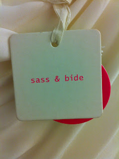
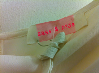
pink ‘Sass & Bide’ labelling on the garment labels and swing tags which really stands out against the stark white background. The
typography used is clean and modern and there is no evidence of promotions
being advertised which enhances the high-end nature of the store. The shopping
bags also convey the Sass & Bide aesthetic, featuring touches of neon
yellow set amidst white and beige. A nice touch is the way that the same
organic textured ribbon which attaches the swing tags to the garments is also
used for the handles of the shopping bags.


A maximum of two garments of any one style feature on the racks and
this, coupled with the pristine white wooden hangers, makes the customer keenly
aware of the high-end nature of the label. Another small detail I noticed is
that all the garment swing tags are left hanging out to minimise the customer
handling of each garment and to keep each item in as perfect a condition as
possible.
The sole sales assistant served to further tell the
narrative of the brand, conveying the effortlessly sleek yet edgy aesthetic
Sass & Bide is renowned for. She was wearing skinny, slightly washed out
black denim jeans and a relaxed black knit, appearing fresh and approachable. Counter
tables were sleek, white and circular, topped with glass. A particularly
quirky, edgy touch was the white sunglasses stand which appeared to resemble a
skeletal spine (another tribal inspired touch).
The Sass & Bide website very much remains in line with
the in-store experience. It is predominantly white with bright splashes of
colour usually appearing in the images of the garments, and the models which
feature in the online look-books are striking fun, edgy poses. It is a very
straightforward website to navigate because of the well laid out and sleek
appearance. One thing I have noticed in both the Sass & Bide store and on
the website is that the garments really do the talking. The stark white is
certainly the best backdrop to allow the bold colours and rich embellishments
tell the story of the season. Sass & Bide have also created a blog which
maintains the aesthetic of the label as it features very minimal amounts of
texts and each blog post usually contains one primary image or photograph which
tells a story in itself.
The brand seems to engage very well with the media, agreeing to do
interviews and feature in designer profiles. Their garments are frequently
found in magazines and they do have a celebrity following which includes Sarah
Jessica Parker (Turner 2011) and Rosie Huntington Whiteley (Sass & Bide 2012). Sass & Bide is widely
acknowledged for their highly sought after denim, however, they have also made
a name for themselves in the media for ‘the clash’ which features in their
garments when unlikely combinations are paired together, for example silk
georgette and neoprene. This clash is defined well by fashion editor Meenal
Mistry who labels the Sass & Bide woman ‘an elegant and ladylike urban
warrior’. (Mistry 2011) Clare Press has labelled Sass & Bide a ‘likely
contender for the title of defining Australian Style.’ (Press 2010) Therefore
it can be found that the label has settled into a highly respected place of the
Australian fashion industry.
Thus, it can be found that the Sass & Bide label
successfully conveys a clear brand narrative through the harmonious marriage of
all the various components of the label’s branding. These components encompass
details as small as the swing tags and as large as the label’s relationship
with the media.
Bibliography


.JPG)
.JPG)
.JPG)
.JPG)
.JPG)


